ECOSOC
By 2050 the world’s population is said to peak at 9.6 billion, which will impact the planet especially by the developed world’s overconsumption. Focusing on a shift to a more sustainable living I created a brand identity for ECOSOC (United Nations Economic and Social Council).
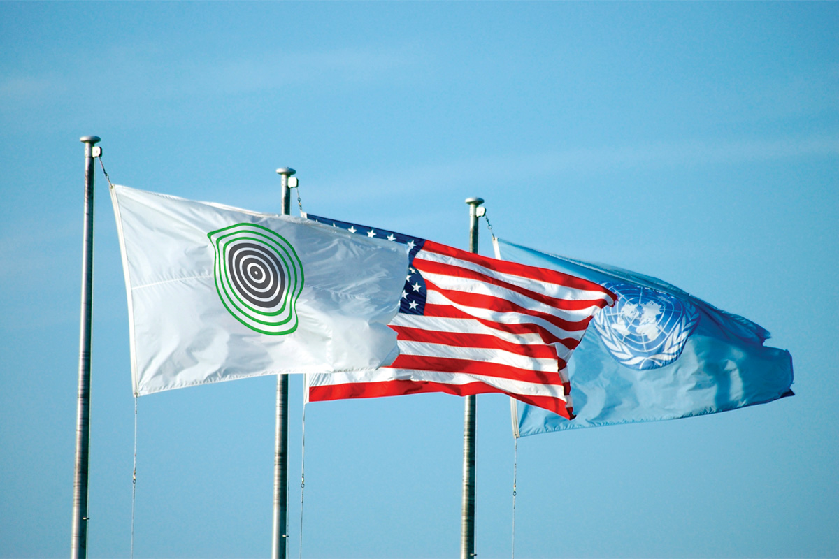
The main element of this brand’s identity is a circle, which both references the planet itself and also portrays a sense of community and unity – 7 circles for 7 continents.
The typography used in the logo is a sans-serif font to underline the idea of “consuming less”.
The created brandmark is not static but instead changes depending on how liveable the Earth is. This is indicated by thick and thin or gray (overconsumption) and green (sustainability) lines.
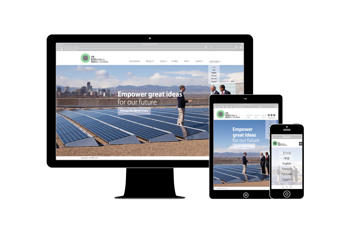
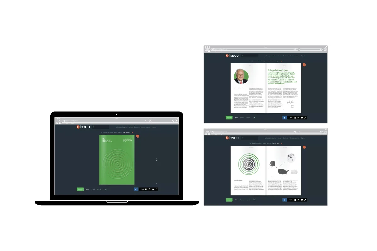
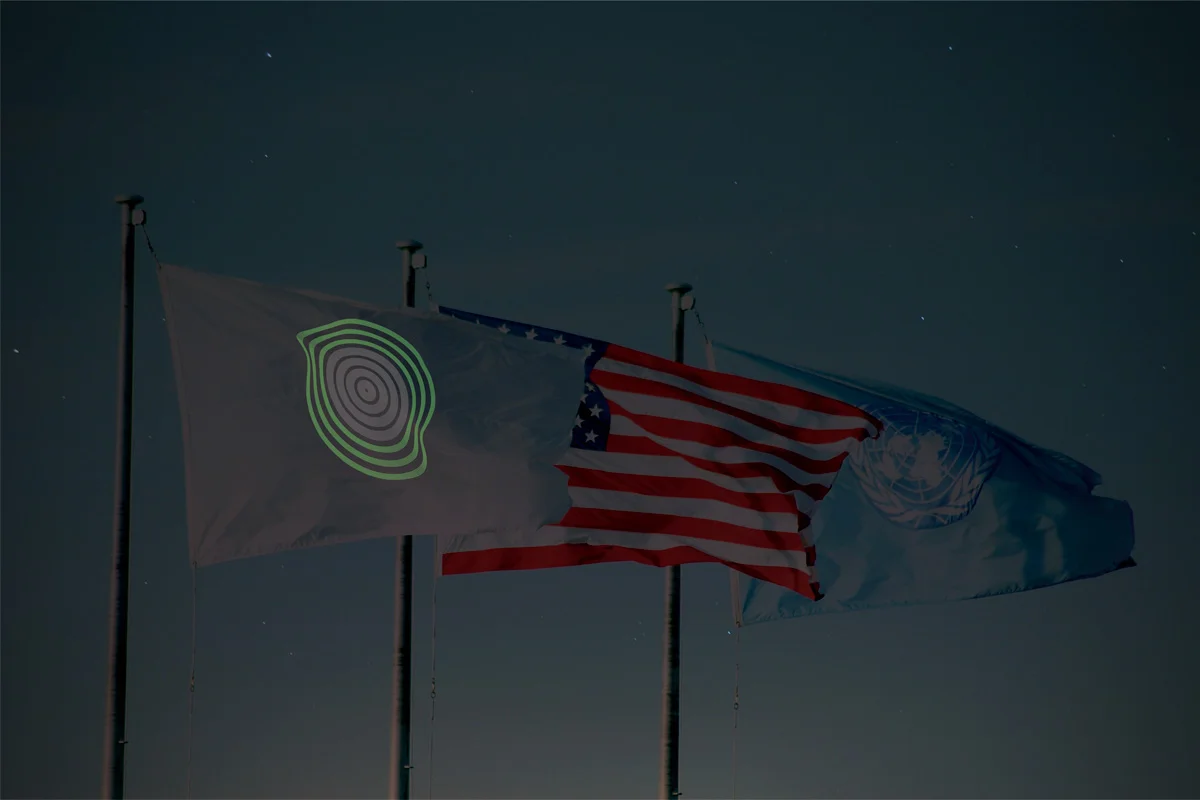
Communications materials include a website, an digital report booklet and a flag with solar powered brandmark that glows in the dark.


